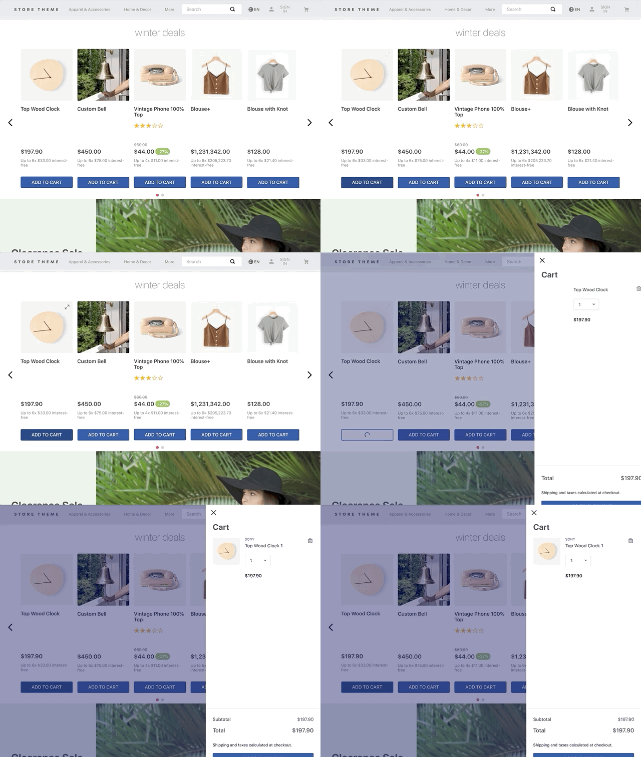
Events or Pixel Events are notifications automatically broadcasted by a website whenever users perform critical actions in your store, such as:
- Adding an item to the cart (
addToCartevent). - Removing an item from the cart (
removeItemevent). - Accessing a loaded page (
pageViewevent). - Seeing a product data (
productImpressionevent).
These events are broadly used by analytics tools, since they allow you to track users' shopping profile and their interaction with your store pages.
Yet, you can take the use of event data to another level: among with the customPixelEventId prop, they can generate side effects on the UI, triggering automatic behaviors in your store components as you desire.
The customPixelEventId prop works as an event sender and receiver depending on the theme block where it was declared in. Its value must always be an unique ID, helping blocks to easily identify which is the event being sent or received upon user interaction on the UI.
In the table below, you can find the list of blocks that currently accept the customPixelEventId as means to work with events, as well as their behavior when declaring the prop:
| Block name | Behavior |
|---|---|
add-to-cart-button | Sends an event whenever it is clicked on. |
minicart.v2 | Receives an event and behave on the UI accordingly. |
drawer-trigger | Sends an event whenever it is clicked on. |
drawer | Receives an event and behave on the UI accordingly. |
modal-trigger | Sends an event whenever it is clicked on. |
modal-layout | Receives an event and behave on the UI accordingly. |
In the step by step below, you are going to learn how events and the customPixelEventId prop can trigger side effects on the interface in a real scenario, configuring the Minicart to automatically open itself once a new product gets added to it by the Add To Cart Button.

Step by step
- Make sure the apps whose blocks are responsible for sending and receiving the desired event are already listed as dependencies in the theme's
manifest.jsonfile:
_10"dependencies": {_10 "vtex.minicart": "2.x",_10 "vtex.add-to-cart-button": "0.x"_10}
- Declare the
customPixelEventIdprop in the block responsible for sending the desired event, passing as its value an unique ID. For example:
_10{_10 "add-to-cart-button#example": {_10 "props": {_10 "customPixelEventId": "example-add-to-cart"_10 }_10 },_10}
- Declare the
customPixelEventIdprop in the block responsible for listening to the desired event, passing as its value the same unique ID previously declared in the sender block. For example:
_10{_10 "minicart.v2": {_10 "props": {_10 "customPixelEventId": "example-add-to-cart"_10 },_10 "children": ["minicart-base-content"]_10 }_10}
Once you save your changes and deploy your new Store Theme version, the Add To Cart Button component will send the example-add-to-cart event whenever it is clicked on. At the same time, the Minicart will be ready to automatically open itself as a response to any received event with this ID.
You can check out this behavior live in our default Store Theme implementation!