Responsive Layout allows you to declare layout structures that will only be rendered in a specific screen-size breakpoint.
This app defines and exports four blocks:
responsive-layout.desktopresponsive-layout.mobileresponsive-layout.tabletresponsive-layout.phone
Each block has composition: children, which means that it expects to receive an array of children blocks for rendering if the current screen-size is right for its breakpoint.
Configuration
- Import the Responsive Layout app to your theme dependencies in the
manifest.json. For example:
_10 "dependencies": {_10 "vtex.responsive-layout": "0.x"_10 }
- Add the
responsive-layoutblock to your theme. For example:
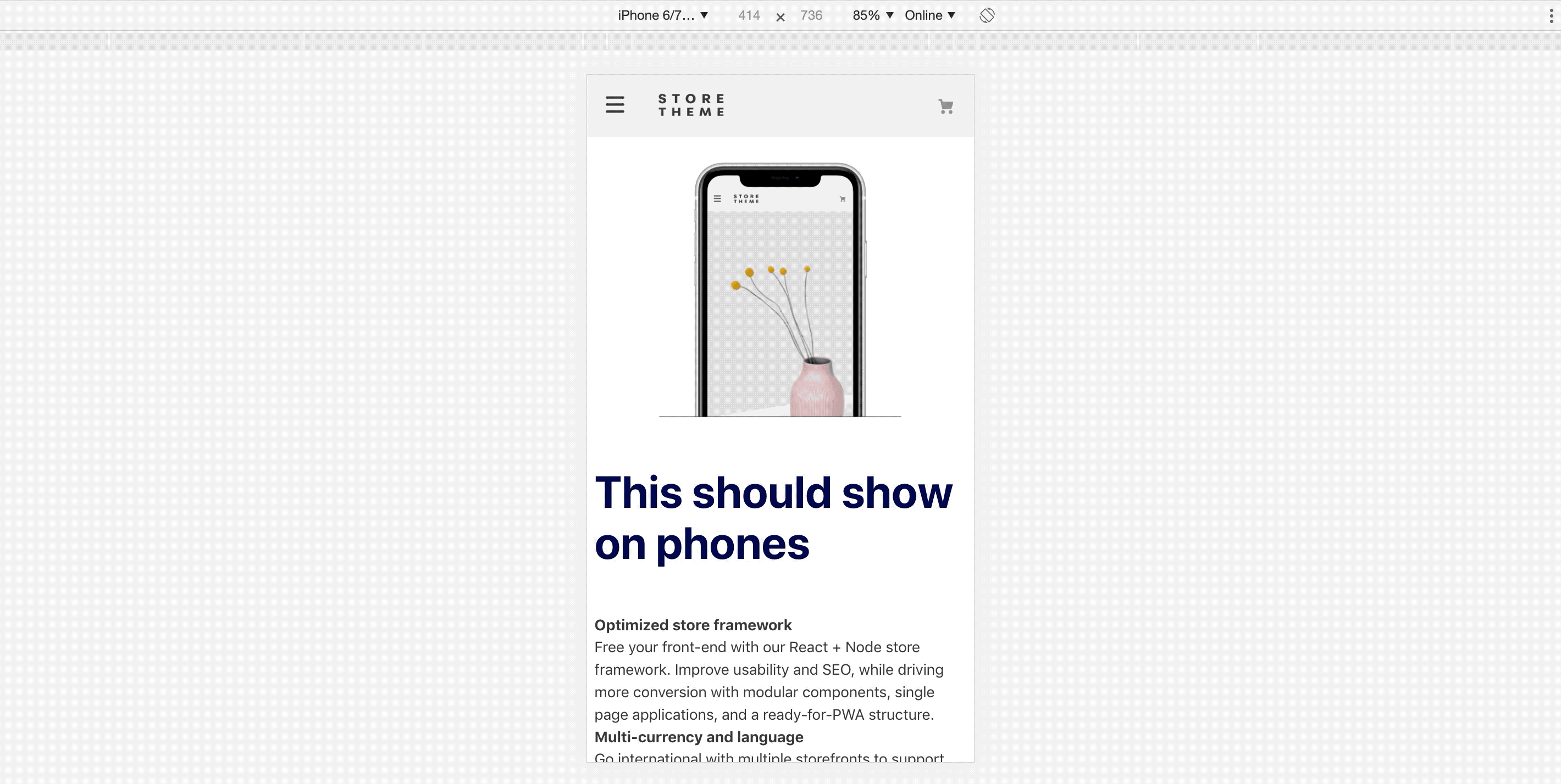
_36 "store.custom#about-us": {_36 "blocks": [_36 "responsive-layout.desktop",_36 "responsive-layout.tablet",_36 "responsive-layout.phone"_36 ]_36 },_36_36 "responsive-layout.desktop": {_36 "children": ["rich-text#desktop"]_36 },_36 "responsive-layout.tablet": {_36 "children": ["rich-text#tablet"]_36 },_36 "responsive-layout.phone": {_36 "children": ["rich-text#phone"]_36 },_36_36 "rich-text#desktop": {_36 "props": {_36 "text": "# This will only show up on desktop.",_36 "blockClass": "title"_36 }_36 },_36 "rich-text#tablet": {_36 "props": {_36 "text": "# This will only show up on tablet.",_36 "blockClass": "title"_36 }_36 },_36 "rich-text#phone": {_36 "props": {_36 "text": "# This will only show up on phone.",_36 "blockClass": "title"_36 }_36 },
Note that you could use any array of blocks as children, given that they are allowed by the block that is directly above responsive-layout.